8/30/09


Egypt
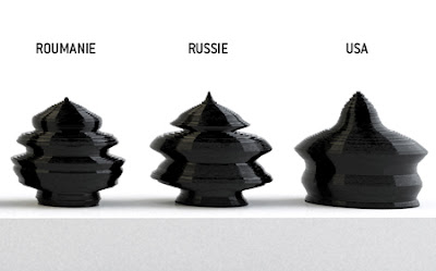
Artist and Designer Mathieu Lehanneur has created a series of urns that map out the demographics of age in various countries of the world. Each urn is made up of 100 ceramic layers representing the current population levels from ages 0 to 100, and is finished in black enamel.

A comparison of the demographics of three different countries
The result is more than a resting place for a statistician's remains. It is a vivid reminder our own mortality as we find our own place in the stack and see what the future holds for us and our contemporaries. The urns also show the disparities in life expectancy and mortality rates between the first, second and third worlds. Look at Egypt, with all the weight on the bottom, a nation of youths without much hope to live into middle age, let alone reach 100. Look at Japan; here is an urn without a steady base as fewer children are born to support the heavy load on top.

France
As beautiful and visually striking as they are thought provoking, these urns say perhaps more about the universal condition that anything about the individual who may at some point rest within. Perhaps that is the point. Part of accepting the reality of death and our own eventual demise requires this realization;
Each of us is just bit of data in the big picture, and every other bit of data represents a unique individual with hopes and dreams just like our own.

The urn that maps age distribution and life expectancy in Japan during production
The Age Of The World containers are 60 cm high x 60 cm wide and are made of enameled ceramic at Vallauris by Claude Aiello.
-from Mocoloco

Finished Japan Urn


2 comments:
Wow, these are amazing, who knew stats could translate into such beautiful objects. Japan is especially gorgeous, and I have to admit that the US urn looks a little dumpy.
Patrick, I just love visiting your blog. Where ever do you find these amazing stories. :0) All the best
Post a Comment